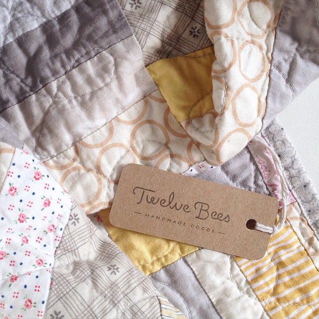
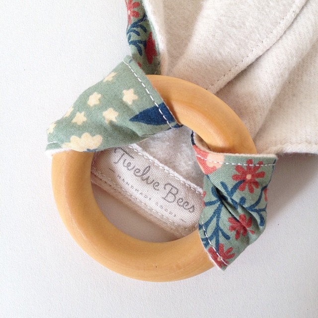
My friend Becky is an amazingly talented seamstress and all-around maker. She creates beautiful quilts, tee-pees and other lovely little items. She wanted a logo for her business that reflected her style: warm and personal, yet modern.

This project was a bit of a challenge; the first few concepts just weren’t hitting the mark. We started out with a round version that, although unique, just wasn’t practical. The more traditional script style of Version 2 looked promising at first but still didn’t resonate with Becky (too country). I continued refining the mark to make it feel more modern; the lowercase letterforms from Version 3 were starting to feel right but weren’t quite there.
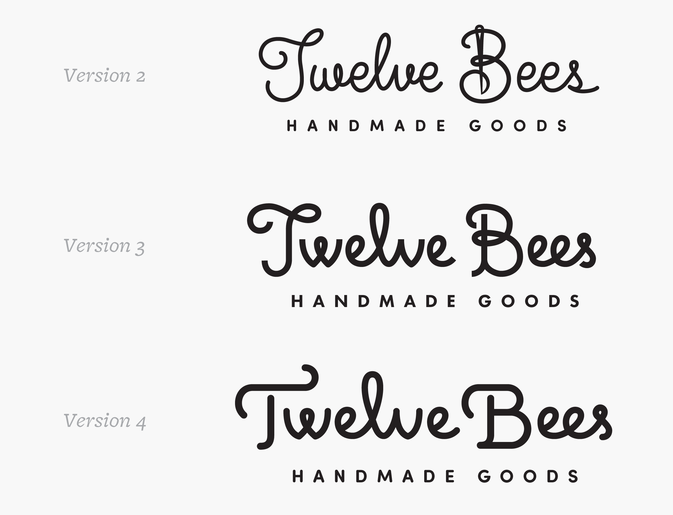
I went back to the drawing board for some typographic reference and was inspired by DSType’s Estilo Script from a previous project. The tweaked uppercase T and B are a pleasing combination of calligraphic and modern. Opening the counters of each lowercase ‘e’ and breaking up the ‘l’ and ‘s’ really brought the mark together; they allude to stitching without being too obvious.
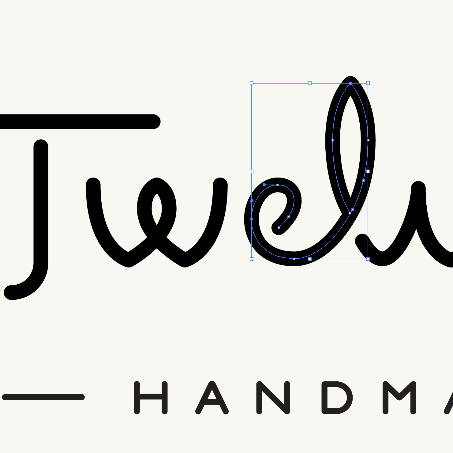
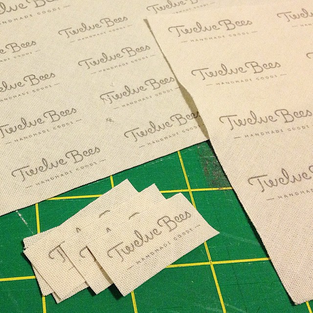
The result is a logotype that Becky is thrilled with and really represents her business. I suggested getting two custom stamps made for the logo and website address so she had flexibility when making tags, cards and other promotional material. Ever the crafter, she even made the labels by inkjet printing onto fabric and heat-setting with an iron!
